for Enhanced Operator Efficiency
playful micro-interactions
playful micro-interactions
The story begins in 2021, a critical year when the VGT sports platform sought to bolster its competitive edge in a crowded market. To achieve this, the company set out to transform its product, migrating from traditional web-based features to a dynamic mobile app.
In this case study, I led a team of three talented designers through an ambitious journey of exploration, testing countless hypotheses and conducting experiments. We infused the app with lively micro-interactions to elevate user retention, injecting energy and delight into every tap and swipe.
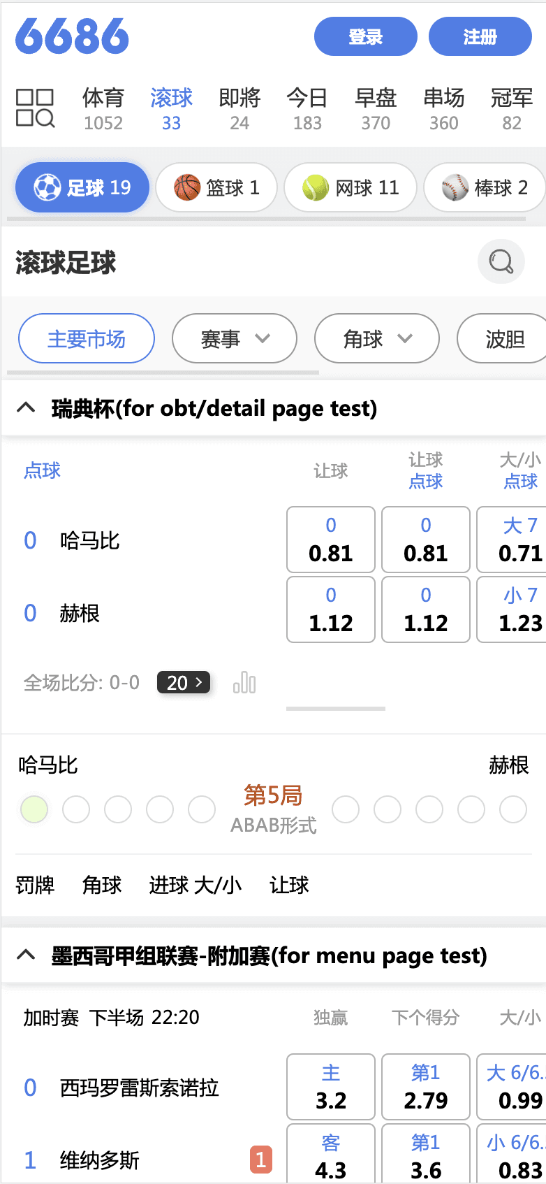
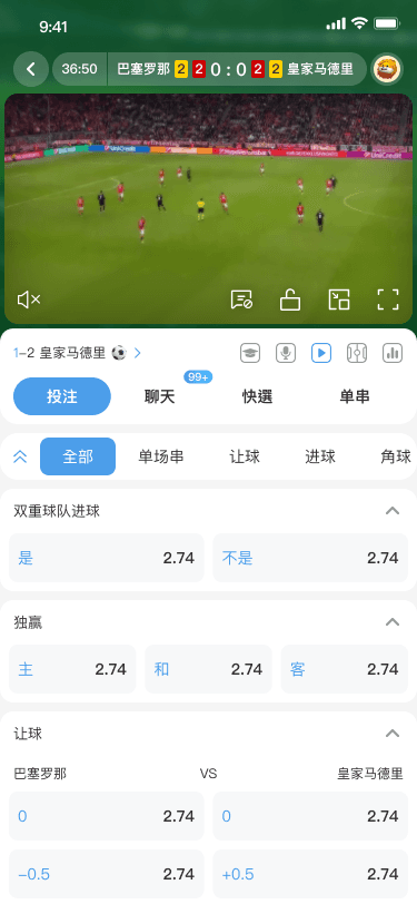
Evaluate the information structure and usability challenges of the old version of the web page design.
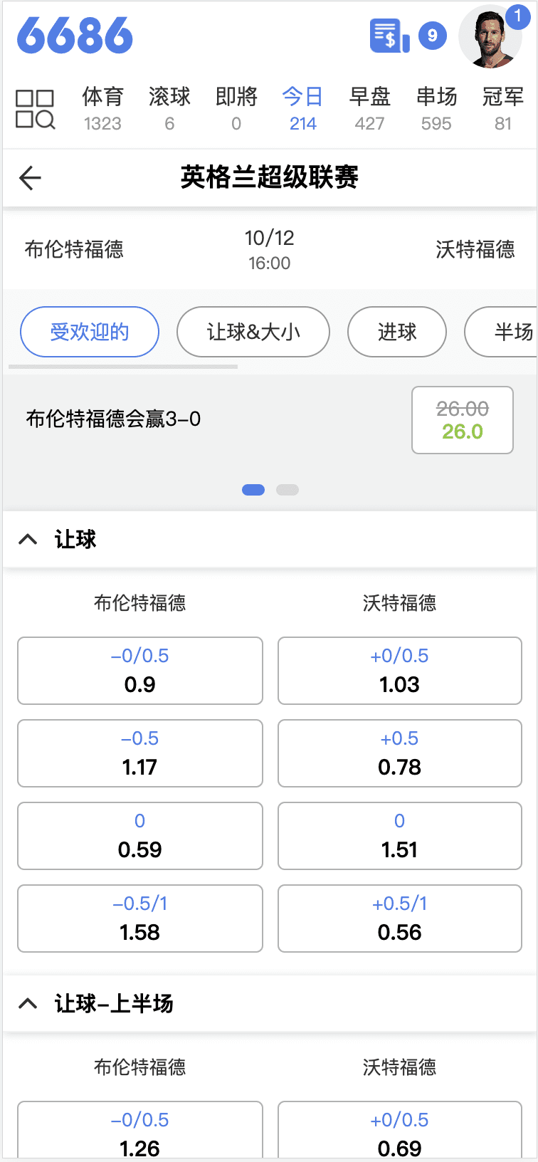
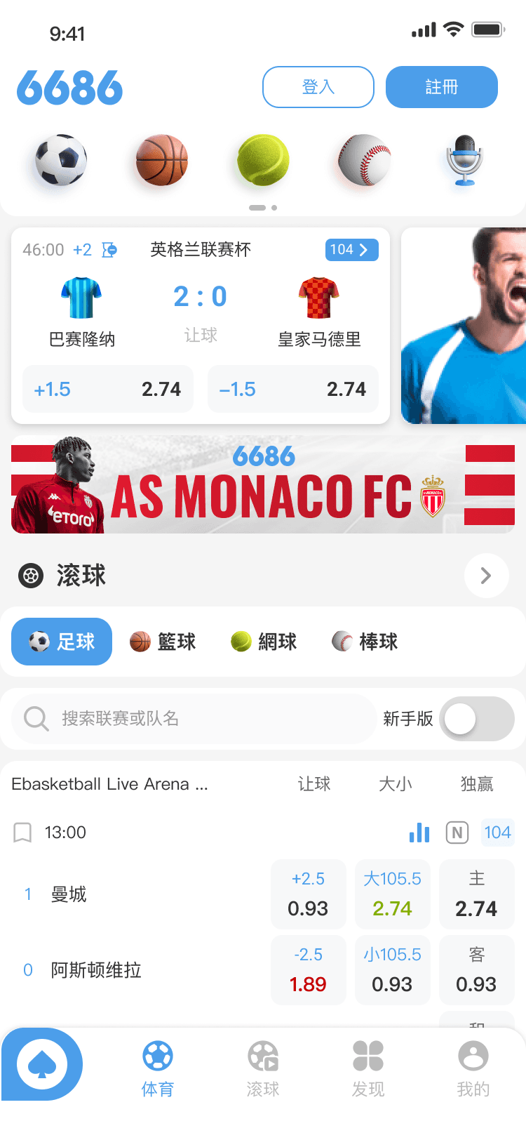
Excessive theme color buttons and cluttered screen space reduce the user's efficiency in viewing odds. The odds marking buttons present a similar issue.
Product operates in a "gray area" (likely implying a sensitive, niche, or legally ambiguous domain, such as sports betting), accessing real users for UX research can indeed be challenging. This limitation requires creative and indirect approaches to gather insights while ensuring the product's feasibility and user-centered design.
Every company hopes to provide users with a wide range of options for quick selection, leveraging the style of clutter design combined with favorable odds to increase user betting rates.
User Flow:
Picturing the User Journey
User Flow:
Picturing the User Journey
We have established the MVP and set the user flow for the 1st demo.
Design Process & Solutions
Design Process & Solutions
Design Process & Solutions
Design Process & Solutions
Wireframe
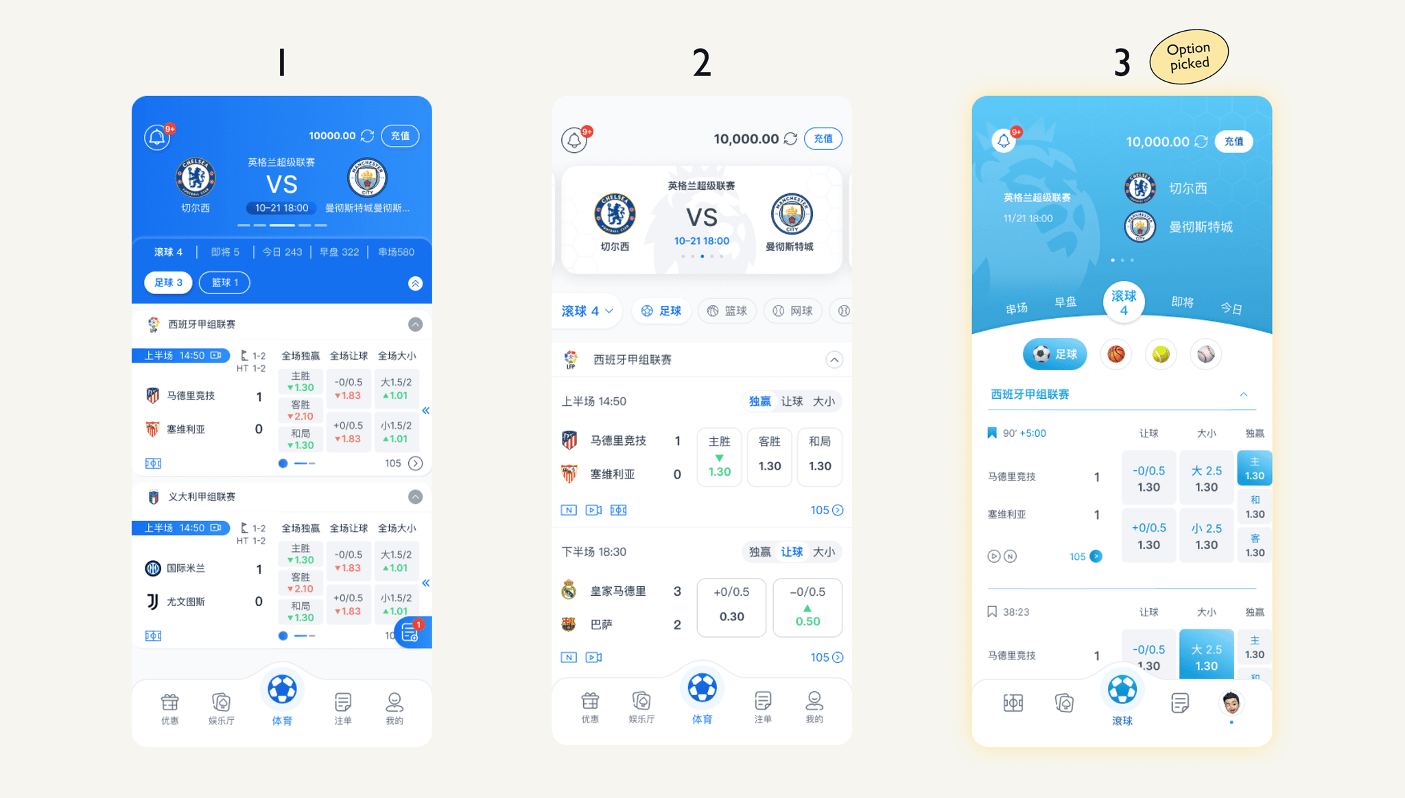
Ideation & Prototyping
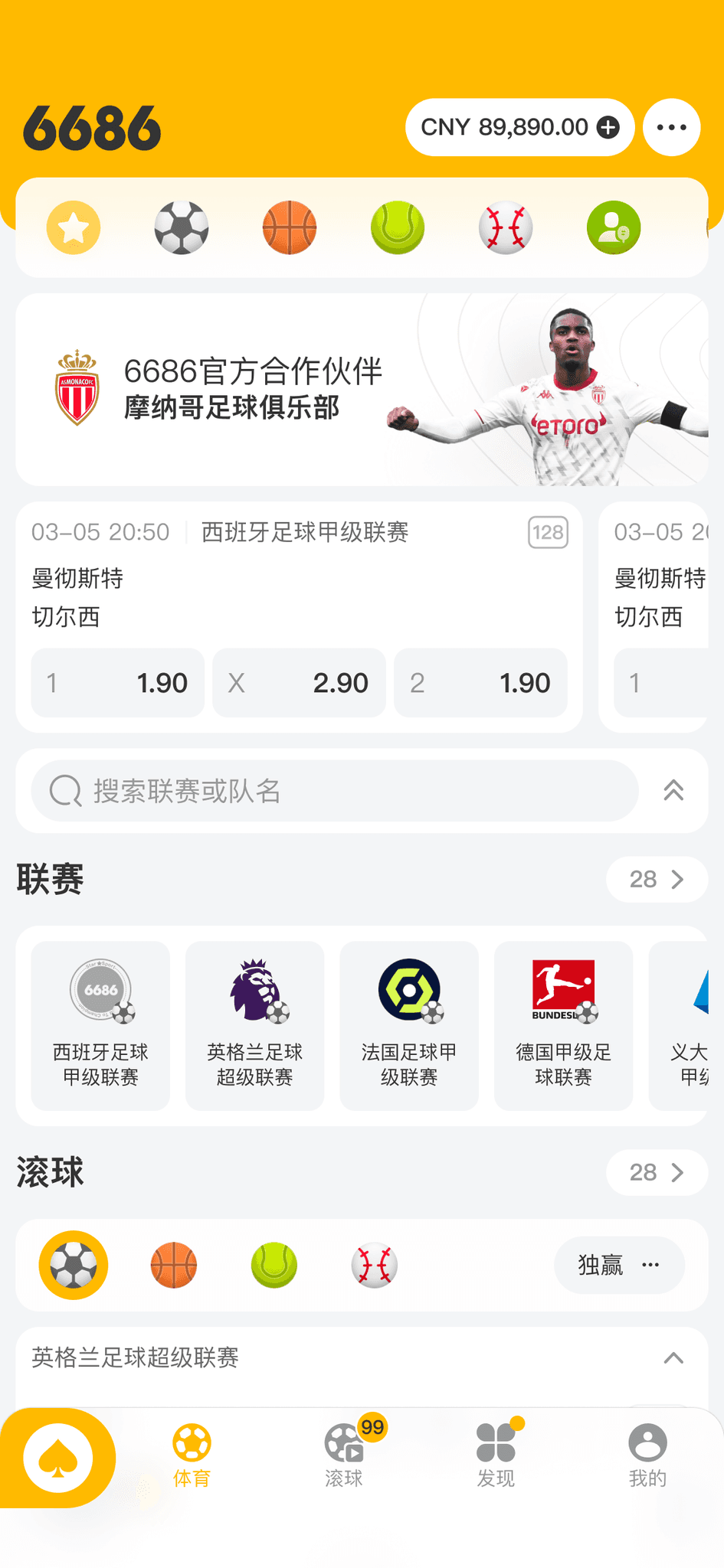
We created three style options for selection. Ultimately, the stakeholders selected the vibrant blue style, distinguished by ample breathing space to enhance readability and reduce visual pressure, along with robust graphic support from the sports league.
Final Solution
Proposed Solutions:
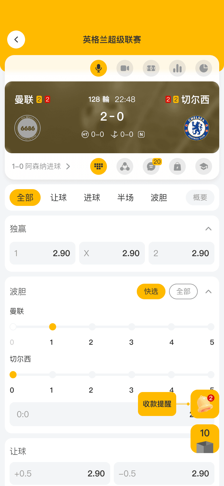
The final design features an intuitive navigation system, streamlined workflows, and a visually consistent layout.
Key elements include a minimalist home screen, easily accessible menus, and responsive interactions tailored to user habits.
The app successfully reduces friction and enhances user satisfaction.
The native app enables our designers to explore a wide range of possibilities and opportunities in motion design. It allows us to create a UI that is more dynamic, joyful, and human-centered.
Boosting Usability and Readability
We overhauled the Sport Bet App for top-notch usability and readability. By simplifying the interface, we made key features like match selection and betting options instantly accessible. Clear fonts and high-contrast colors ensure easy reading in any light. Users love the intuitive flow, and data shows a 20% drop in task time, proving our design rocks.
Animations for Next-Level Entertainment
We added dynamic animations to amp up the app’s fun factor. A celebratory twinkling effect follows successful bets, and smooth transitions highlight real-time odds. It call the experience “immersive,” making betting feel like an exciting game.
Aesthetic-Usability Effect
Using the Aesthetic-Usability Effect, we designed a sleek, modern look with gradients and clean icons. This polished style boosts trust, making the app feel reliable. Tests show 90% of users find it more intuitive, despite unchanged features. The stunning design enhances perceived usability, helping the app shine and keep users hooked.
As the Design Team Lead, I spearheaded the development of my first native app. Despite challenges and team changes, we completed the project. The app provides advanced, stable, and impactful support, significantly contributing to business growth.
In the future, we could systematize feedback documentation and establish a long-term tracking mechanism to monitor user adaptation, enabling continuous improvement.
We cannot please everyone. The key is to identify the needs of the primary user groups and address them first.
Over the past three years, we have continued to develop and maintain our product, including both the mobile app and web platform, releasing versions 3.0 and 4.0.
Although the product structure has remained largely unchanged, we have continuously improved and enhanced the user experience to sustain user engagement and retention.
3.0 - 2023~2025
Focus on Asia Market
4.0 - 2025 MAR
Focus on international
The first native app we built for 6686 delivers a consistent and seamless user experience.
Compatible with iOS and Android
As the UI/UX Lead, I managed a team of three designers and worked closely with stakeholders, product managers, and developers.
Appreciate your valuable output, folks!!